Displaying a Distribution System in AGVis
This update adds a lightweight, file-based path to visualize a distribution grid in AGVis—no ANDES or DiME required. It leverages AGVis’s MultiLayer feature to load nodes (buses) and lines directly from an Excel workbook. This complements our existing LTB visualization workflows showcased previously.
What you can do
- Render any distribution system (feeder, lateral, tie lines) on the map from a single Excel file.
- Toggle visibility, set custom colors, adjust node size/line thickness, and layer multiple systems at once (e.g., “Feeder A” + “Tie map”).
Prerequisites
- AGVis ≥ the build that includes MultiLayer (left sidebar “+/–” icon).
- One Excel file (
.xlsx) containing two sheets named exactly:- Bus — required columns:
idx,xcoord,ycoord
Optional:name,type,color - Line — required columns:
idx,bus1,bus2
Optional:name,color
See the official example workbook referenced in the docs.
- Bus — required columns:
Excel schema (minimum)
Bus sheet (nodes)
idx(int): unique node IDxcoord(float): longitudeycoord(float): latitude
Optional:name(str): used by AGVis searchtype(str): keyword to assign an icon (e.g.,load)color(hex): put one hex value (like#FF8800) in the first cell of this column to color all nodes from this file unless overridden in UI.
Line sheet (edges)
idx(int): unique line IDbus1(int): from-nodeidxbus2(int): to-nodeidx
Optional:name(str)color(hex): same “first-cell only” convention as Bus.color.
Tip on icons:
typesupports keywords (e.g.,load,compressor,ptg, etc.) to render custom node icons. First matching keyword wins; not case-sensitive.
Minimal example (for a small feeder)
Bus
idx | xcoord     | ycoord     | name
1   | -83.939120 | 35.922410  | SubA
2   | -83.935500 | 35.924900  | FeederA-01
3   | -83.932700 | 35.926400  | FeederA-02
Line
idx | bus1 | bus2 | name
1   | 1    | 2    | SubA–FeederA01
2   | 2    | 3    | FeederA01–02
This satisfies the required columns and demonstrates optional styling.
How to load in AGVis
- Open AGVis and click the +/– MultiLayer icon (left sidebar).
- Click Add Layer, choose your Excel file. If the two sheets are valid, AGVis lists the layer with display options.
- Use:
- Toggle Rendering to show/hide the layer,
- Custom Colors toggles to enforce UI colors or respect your Excel first-cell hex,
- Opacity and Size sliders to tune readability,
- Prioritize Layer to draw one layer above others (helpful when feeders overlap).
Example
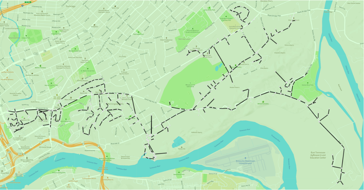
As an example, the following figure shows how a distribution network in East Knoxville can be rendered in AGVis using the MultiLayer Excel input.
This demonstrates radial feeders and tie lines drawn directly on the geographic map.
Notes for distribution systems
- Coordinates: use geographic lon/lat (WGS-84).
- Radial feeders & tie switches: represent all sectionalizing and tie segments as Line rows; topology itself is implicit from
bus1↔bus2. - Multiple feeders/areas: create one Excel per area or reuse one file and load multiple layers—then use Prioritize Layer to manage overlap.
Reference
- AGVis Docs – Advanced Usage → MultiLayer (sheet names, required/optional columns, UI options, icon keywords, and example workbook).
Leave a comment